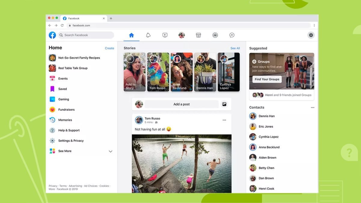
Facebook gets a makeover: Introduces new Facebook for desktop

Facebook has been working on a new design for Desktop over the last year. The new design has already been launched for the mobile app in 2019. Facebook had announced the news in the F8 developer conference last year.
And since March 20, 2020, Facebook users can try out the new design from their desktops as well. The social media giant has started rolling out its new redesigned Desktop site to its users for a try out. It should be available to most users now since its already been more than a week since the roll out started.
According to Facebook, the main purpose of the new design has been to bring back focus on groups and events. The two most important features are what bring people to Facebook, bringing real-time social interaction online.
At present, Facebook is allowing its desktop users to experience the look and feel of the new design. This new design is scheduled to be launched later this year. So before it gets permanent you can either continue with the new design or switch back to the Classic Facebook look.
New Facebook looks very clean and neat with a much spaced out organization. They have increased the text font size. On the left-hand side you can see shortcuts for Groups at the bottom. And on the top you have options for Events, Friends and Memories.
Above the story section you have five menu options: Home, Watch, Marketplace, Groups, and Gaming. You can see there is very little of News Feed, which I personally think is for the better.
You get to use the Dark Mode as well. Both the white design and the dark mode looks really sleek and classy. You can easily enable the dark mode through a toggle switch in the settings.

Key Features
- The Groups tab facilitates faster and more streamlined navigation to find your interests.
- This further helps in keeping up with your interests without fussing over News Feed
- The Dark Mode helps down to cut on the screen glare and gives a more eye-friendly option.
- Photos and Videos can be viewed in a larger screen area giving more immersive feel to the user.
- The Marketplace option catalogs all the essential stuff you may want to buy in one place.
- The Watch option gives you suggestions of shows and lists the channels. The content would be made customizable according to user interest.
- The Gaming option is specially meant for the gamer to pursue his interest further. It clearly showcases how Facebook is focusing on events and groups.
You can easily switch back to Classic Facebook Mode whenever you want to.
New Facebook is here to stay and the first look is a win for me. It has a very contemporary feel to it. The options are simple and easy to use. Facebook has kept the focus on interests of its user instead of pushing unwanted information on the page. New Facebook will be launched later this year.

No comments